Skip to content

Draft Studio

A rental fleet that had to sell itself in two languages, on a phone, in under a minute.

CLIENT
KSSK Car Rental
INDUSTRY
Car rental · Klang Valley
SERVICES
Website UI/UX · Design system
YEAR
2026
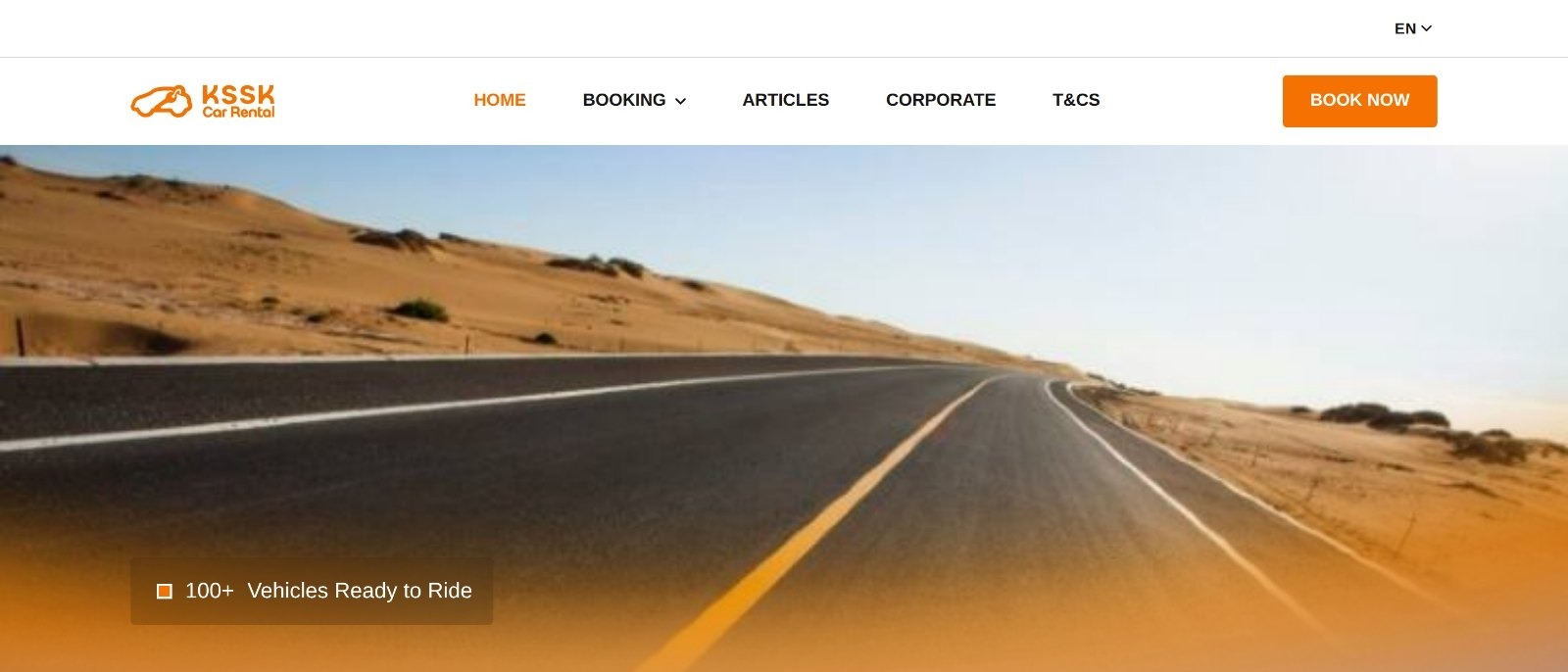
The KSSK Car Rental home page: brand header with an English and Bahasa Malaysia switcher, hero, and the booking widget asking for delivery address, return address and dates.

The challenge

KSSK delivers rental cars to your door across the Klang Valley. Renting a car is a comparison purchase: most people check three or four operators on the same four things - price, seats, transmission, and whether it can reach them. Anything that hides those four costs a booking.

The site also had to carry the whole transaction, not just the shopfront. Browse the fleet, compare, book, pay, verify, then manage the booking afterwards - eleven screens, each one needed in English and Bahasa Malaysia, for a fleet whose prices and terms differ per vehicle.
The approach

We built it as a design system first and a website second. One token layer - colour, type, spacing, radii, elevation and motion - is the single source of truth, and no template is allowed to inline a value. That is what keeps twenty vehicle pages and eleven screens reading as one company rather than eleven.

A structured fleet, not pages

Every vehicle is a record rather than a layout: rate by day, week and month, seats, transmission, fuel, luggage, engine and category. The card, the comparison and the detail page all read the same fields, so a price is changed once and is right everywhere.

Two languages, equally

English and Bahasa Malaysia are both first-class, down to each vehicle’s four selling points and its own Malay search title and description. Nothing is a translation layer bolted on at the end.

Rules where the decision is

Two-day minimum, free delivery within 5 km and quoted beyond it - stated on the booking widget itself rather than buried in a terms page nobody opens before deciding.

Honest empty states

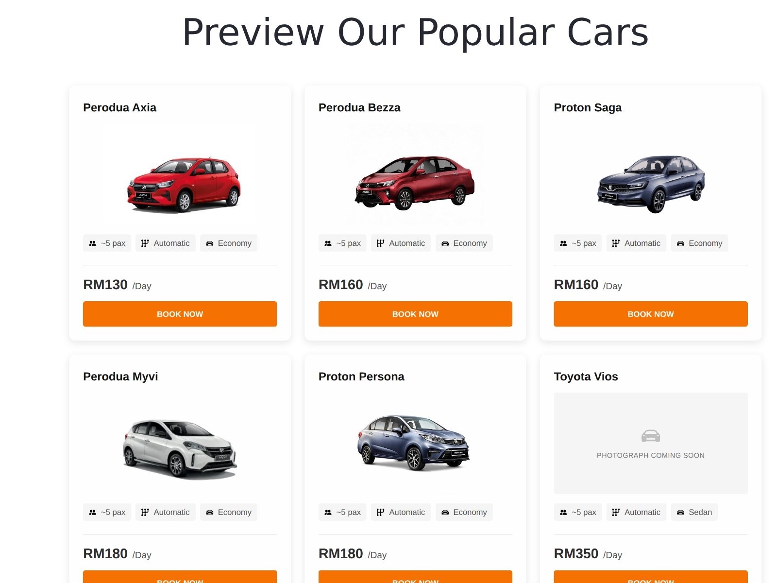
A vehicle still waiting on photography shows a labelled placeholder instead of a broken frame, so the fleet can grow in public without the site looking unfinished.

The KSSK fleet grid: vehicle cards showing photograph, seats, transmission and category, with the daily rate and a book button, including a labelled placeholder for a car still awaiting photography.
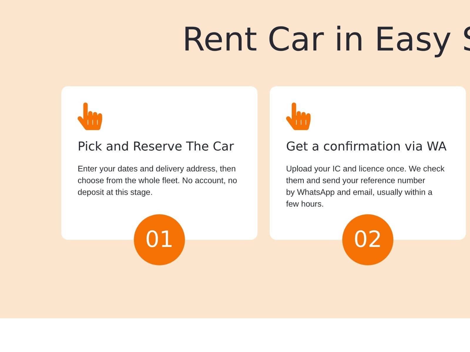
The KSSK booking steps section, showing the rental journey laid out in sequence.

The result

2

languages carried on every screen, en-MY and ms-MY

20

vehicles in four categories, each one a structured record

11

screens, fleet to booking management, on one token set

Got a fleet that deserves a better shopfront?